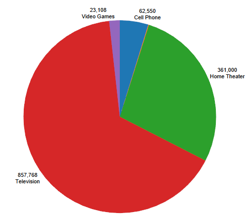
Pie charts are one of the most popular visualization tools in data analysis because they are simple and intuitive, allowing users to compare proportions at a glance. Tableau, a powerful data visualization tool, makes it easy to create pie charts and customize them to suit your needs. However, adding and positioning labels inside a pie chart in Tableau can sometimes be challenging. This article will walk you through the process of adding labels inside a pie chart and provide tips for customizing them effectively.
Step-by-Step Guide to Creating a Pie Chart in Tableau
1. Build the Initial Pie Chart
To create a pie chart in Tableau, follow these steps:
- Select Your Data: Start by selecting the data you want to visualize. Typically, you’ll have a dimension (such as categories, products, or regions) and a measure (such as sales, profit, or quantity).
- Drag and Drop: Drag the dimension to the Columns or Rows shelf and the measure to the Size shelf on the Marks card.
- Change the Mark Type to Pie: On the Marks card, click on the dropdown menu and change the mark type to Pie.
- Build the Pie Chart: Once the mark type is changed to Pie, the chart will automatically update. You may also want to drag the measure to the Angle shelf to adjust the size of each slice based on the values.
2. Add Labels to Your Pie Chart
Now that you have the basic pie chart created, the next step is to add labels. In Tableau, labels can display information like category names, values, and percentages, which are helpful for providing context to viewers.
- Drag Dimension/Measure to Label: On the Marks card, drag the dimension (e.g.,
Category) or measure (e.g.,SUM(Sales)) that you want to use for the label to the Label shelf. Tableau will automatically place the labels on the slices of your pie chart. - Edit the Label Format: By clicking on the Label shelf, you can format the text. You may choose to display only the category, only the measure, or both. Tableau also gives you the option to customize the text size, font, and color.
3. Position the Labels Inside the Pie Chart
One of the most common challenges in Tableau is ensuring that the labels fit properly inside the pie slices, especially when dealing with small slices. Here’s how you can move the labels inside the pie chart:
- Adjust Label Position: In the Label shelf, click on the Label Position dropdown. By default, Tableau places labels on the outside of smaller slices. To move them inside the slices, select the option for Center or Inside. This will attempt to place the labels directly within the pie chart.
- Enable Allow Labels to Overlap: Sometimes, due to the size of the slices, labels may overlap or move outside of the pie. In the Label shelf, you will find an option that says Allow labels to overlap other marks. Enabling this option can help position labels within smaller slices, though this may make the chart harder to read in some cases.
- Resize the Pie: If the labels still do not fit well inside the pie slices, resizing the pie chart can help. You can use the Size slider on the Marks card to increase the size of the pie, which may create more space for the labels.
4. Improve Readability with Formatting and Customization
To enhance the readability of the labels within the pie chart, you may need to make additional adjustments:
- Increase Font Size: Larger font sizes can make the labels easier to read, especially when placed inside small slices. Adjust the text size from the Label shelf.
- Use Abbreviations or Shortened Labels: If the text is too long, you can edit the labels to display abbreviated versions or just the key information. For example, instead of showing “Product Category: Sales,” you could simply display “Category” or just the sales figure.
- Add Percentages: Pie charts often work best with percentages rather than raw values. You can add percentage labels by dragging your measure to the Label shelf, clicking on it, and choosing Quick Table Calculation > Percent of Total.
5. Best Practices for Pie Charts
Although pie charts are commonly used, they come with their limitations. It’s important to follow best practices to ensure clarity and accuracy:
- Limit the Number of Slices: Pie charts are most effective when they contain fewer slices. More than five or six slices can make the chart difficult to read and interpret, especially with small differences between values.
- Consider Alternative Visualizations: In cases where a pie chart is overcrowded or unclear, consider using alternative visualizations like bar charts or stacked bar charts. These often provide clearer comparisons of data.
Conclusion
Adding labels inside a pie chart in Tableau is an essential step for making your visualization informative and easy to understand. With the right positioning, formatting, and best practices, you can create effective pie charts that clearly convey key insights. Following the steps above will help you ensure your labels are well-placed and readable, making your Tableau dashboards more impactful.

